An interesting development within hospitality, a new dual-brand hotel in Downtown Los Angeles is bringing a striking 37-story addition to the skyline, along with 12 new dining and entertainment venues. By positioning two distinct brands under one roof, the hope is to broaden the property’s appeal to a much wider audience of visitors, and distinguish the properties by boldly divergent design.

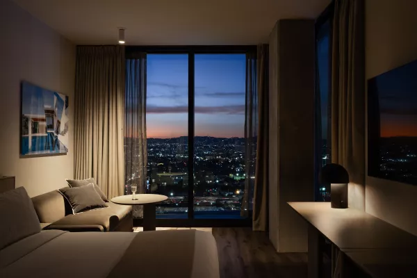
AC Hotel LA
This article was originally published in the Summer 2023 issue of Hospitality Ireland Magazine, in July of 2023.

AC Hotel LA
An interesting approach to two Marriott hotels within one building has been taken in Los Angeles. Moxy and AC are two new downtown hotels designed by Yabu Pushelberg. These dualbranded Marriott properties coexist within one 37-storey building, offering two parallel ways of experiencing Los Angeles. Using design, Yabu Pushelberg created two dimensions of style and spirit for guests to discover and explore.
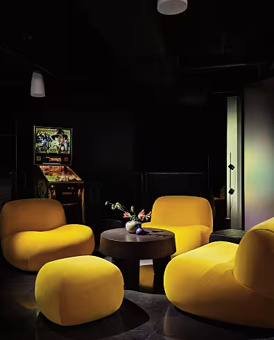
The design concept for Moxy was inspired by the spirit of discovery for which California stands. Yabu Pushelberg’s interior design carves out distinct identities for each hotel while remaining cohesive. For Moxy Downtown Los Angeles (DTLA), the firm departed from the typical Southern California (SoCal) formula of palm trees and sunsets, instead evoking the iconoclastic romance and adventurous spirit of the California desert. Inspired in part by Easy Rider – the cult 1969 film that elevated counterculture and celebrated the great American road trip – the hotel’s interiors are sexy, irreverent and playful, with references to biker culture, desert reptiles, and the gritty romance of the open road.
In contrast, Yabu Pushelberg imagined the interiors for AC Hotel DTLA as an artist’s loft, bringing the Spanish roots of the brand into conversation with the Latin heritage of Los Angeles. Warm, light-filled public spaces are contemporary and welcoming, while upscale serene guest rooms provide a generously sized sanctuary for work or relaxation.
“We always think hard about the sociology and strategy around design – how it affects people and how it makes them feel connected to something,” says Glenn Pushelberg, founding partner of Yabu Pushelberg, along with George Yabu. “Moxy and AC are different brands, but both appeal to travellers who don’t want to stay in a conventional hotel. They’re both for adventurous, bold, curious tastemakers, so the design can’t be generic.”

Moxy Hotel LA
The design process and the final outcome all come down to how people staying at hotels want to feel in spaces and define their time. People want to feel a rainbow of emotions, while remaining confident that the experience can understand and rotate with their moods, needs and desires.
Moxy has a loose and playful energy, while AC is tailored and refined. They have their own unique personalities, yet are tethered together. One responds to the extrovert, and the other responds to the introvert. Depending on one’s emotions, s/he can choose accordingly. If someone is travelling for work, the AC will be the place to which s/he can come back, as the environment is grounded, centred, and aligned with the pace that one needs to recharge. If someone is visiting Los Angeles for exploration, Moxy is the best choice because of its free-spirited nature.
More specifically, Moxy was designed through the eyes of a wanderer. Designing the hotel through this perspective allowed the architects to build a world that champions bold choices. On the other side, AC was designed as an artist’s home. It’s an environment rooted in comfort, beauty and light, with warm, honest materials and a thoughtful collection of art and sculpture that makes guests feel at home, experiencing an ultimate sense of winding down and relaxation. Furthermore, honouring the Spanish heritage of the AC brand was an important parameter, so the focus of the design approach was on Spanish architecture.
Moxy Hotel LA
Read More: Hospitality Ireland Summer 2023: Read The Latest Issue Online!
