How many minute details don’t you notice at a restaurant?
If you’re not an eagle-eyed Michelin inspector, there are countless things you’re missing when you eat out. For example: After the New York hot spot Le Cirque relocated to the Palace Hotel in the late 1990s, it was determined that the backs of the new chairs had to be trimmed down. They were so high that they blocked guests’ views of regulars such as Donald Trump and then-girlfriend Melania, and their ability to be seen themselves.
And then the more obvious problems: the noise level that requires conversation to be shouted; diners seated close enough to one another to stick a fork in a stranger’s entree; the realisation that the dining room has a Siberia, and you are in it.
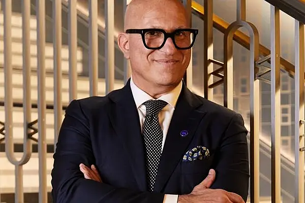
Enter David Rockwell, the guru of design for everything from hotels (Prince Gallery Tokyo Kioicho, the Hotel Bel-Air in Los Angeles) to transportation (JetBlue Terminal 5 Marketplace at JFK) to clubs (Tao at the Dream Hotel in LA). He’s perhaps best known for his restaurants, which range from the original Nobu in Tribeca to Avra Madison and the coming trio of Tao locations at the Moxy Hotel in Times Square. It’s already been a busy year for Rockwell in the world of prime New York restaurants. He re-created Union Square Cafe with Danny Meyer, and then moved Nobu to its expansive downtown setting.
When Rockwell designs a restaurant, he interviews chefs and owners to extract what he calls a “script.” He credits an early interest in theater for this philosophy—and a move to Mexico with his family when he was young, which left him with an affinity for creating spaces that evoke the senses of community, cool, and quality. “Dining in Mexico was celebratory, meals would erupted in pop-up-style places that gave me a sense of publicly shared space,” he says. “I create very different restaurants, but one thing I want to share is that sense of theater and the promise of entertainment.”
Below, Rockwell shares the finer points of his work, from the critical “under-bathroomed” situation in Manhattan to the quest for the perfect banquette. These are the things the designer pays attention to so you don’t have to.
The Entrance of the Restaurant Is More Important Than You Think
It’s all about first impressions. “The entrance is all-important, it’s like the theatre,” says Rockwell. “At Union Square Cafe, which is set on a corner, Danny [Meyer] and I spent a great deal of time deciding whether you would enter on Park Avenue South or 19th Street. Danny wanted a sense of neighbourhood, and so the entrance is on 19th Street and not the avenue. Then you have to imagine the view of a guest the second he or she walks in—customers make snap decisions. What if there are only four people at the bar? You have to consider every situation and create an environment that feels welcoming in all of them.”
The Noise Level Can and Should Be Calibrated
“You’ll always remember when a place is too noisy. It used to be that when people were loud, the staff would turn up the music. And then people would get even louder,” Rockwell says. “Now, noise is such a big subject in restaurants. At Union Square we wanted it to be acoustically comfortable, but you also want to hear the ding of glasses, the energy of the space—that’s why you go out. At Union Square Cafe, micro perforations in the ceiling absorb sound. You can do it in pockets so some spots in the room are noisier than others. At Nobu we perforated the fabric. We wanted a little higher level of din.”
Even the Nicest Place Can Feel Like a Cafeteria If You Don’t Follow This Rule
“Choreography in restaurants is critical. You want to create different spaces. At Union Square we took the open room that is the ground floor and created sequencing. A long wood table and area rug defines the seating near the entrance. It allows you to decide that one evening you might want to be on view and sit in those seats, or in the dining room. On the other hand, you can go upstairs to the balcony—and be an audience member, watching the show. Or in the upstairs booths, which are some of the most coveted seats. It’s a dynamic learned from observing public spaces. You want both continuity but also contrast.
“When it comes to seating design, there is no right or wrong, but there are important ground rules. If you have more than four tables across, it starts to get a cafeteria vibe, and who wants that? So you have to mix in a large table or another element of design.”
His Secret Weapon Is Lighting—Here’s How He Uses It
People may not even notice it, but “lighting choreographs your entire restaurant experience,” says Rockwell. “What you look at—and what you don’t—is determined by the lighting. I had an aha moment about it when I was interning for a Broadway lighting designer and realized the need to use it in architecture. Union Square and Nobu are diametrically opposed spaces. Nobu Downtown is in a basement with no natural light, which gives us the most control. We tempered the lighting to amber throughout, which gives a sense of warmth, while small pin-spot lighting in the wooden canopy creates more visual impact. The new Union Square has light. We replaced the glass walls with smaller windows similar to the original space, and frosted glass on top to stipple the light. When places are open all day now, and a lot of them are, there’s a need to vary the experience, which you do through lighting. You don’t want to eat lunch and dinner at a place that feels the same.”
There Are Very Specific Rules About the Size, Height, and Angle of Your Seat and Table
“Seating is in many ways the most personal part of a restaurant. It defines your social interaction with the place,” he says.
“Next time you’re at a restaurant, pay attention to the seats: the height, the angle, whether your arm fits comfortably balanced on the banquette. Sometimes accompanying details are what personalizes the place. At Nobu, the tabletops are iconic. We found an ancient, traditional Japanese technique of scorching ash that makes you want to touch the table. This is a restaurant where the tables are a big part of your experience as well. With the woven origami-styled wood ceiling and the Peruvian-colored banquettes, the details embrace the food.”
Achieving a Club Experience Means Putting People on View
“We have designed loud restaurants—I’m thinking of Tao. I first worked with the Tao group for Marquee in Vegas. When we designed Tao Downtown in New York, we knew they wanted it to be a club experience, a space that’s incredibly lively, loud, with a DJ. We organised the space to create dramatic visual impact. The entire width of the restaurant leads to the lower level—not unlike the Spanish Steps. We decided to engage people’s desire to sit on a stoop and be entertained and engaged by a club experience, even in a dining room.”
Here’s How to Avoid Restaurant Dead Zones
“One thing you never want to do is create areas and seats that people don’t want to go. Avoid Siberia. My motto: Everyone wants a corner booth. The goal is to create as many corner booths as possible, and sometimes you have to be creative. For instance: At Avra Madison, to draw people to the back of the room, we installed a large seafood display. Now you’re drawn back there, and the seating around it are considered some of the best seats in the house.”
… And About the “Under-Bathroomed” Problem …
“New York City is severely under-bathroomed when it comes to restaurants. It’s hard to think of a place that feels like there are enough. You might not care at a restaurant like the Grill—in a space designed by Philip Johnson, you understand that space is a luxury. Hopefully, your focus there is not the bathroom. But almost everywhere else, New York real estate is a luxury in New York, and the number of bathrooms reflect that.
“You want to avoid people coming back to table ragging about their bathroom trip. We look at individual stalls with communal sinks for certain projects—as well as ways to imbed some element of surprise that make the trip a little more memorable, in a positive way. At Union Square we put an interactive kaleidoscope outside the toilets and created wallpaper from recycled books, to speak to the writers and editors who frequent it. At Nobu we built flattering makeup lighting into the mirror. At the Bel-Air, the bathrooms are incredibly extravagant with luxurious materials and detail: It’s everyone’s fantasy of a bathroom and Hollywood glamour.”
That Whole Brooklyn Aesthetic Thing? It’s Over
“Restaurant trends are always shifting. Just labelk=ling something a trend means it’s already over,” Rockwell says. “There has certainly been a lot of mileage on the repurposed-material aesthetic, which is really what the Brooklyn conversation is about. People won’t get tired of well-crafted materials—let’s talk about industrial materials like hammered concrete signifying something beautiful. But as it gets further away from authenticity, it has less real power, even though people will always think they’re inventing something new when they use repurposed something in their design.”
News by Bloomberg - edited by Hospitality Ireland


